BMA Architects Office
BRIDGEHAMPTON, NY
In order to accommodate our rapidly growing firm, BMA Architects had been searching for new (and rare) office space in a community that has precious little commercial space available. The firm espouses a collaborative work methodology, both internally and externally and the current space, aside from being too small, did not facilitate this way of working. After a two year search, the firm moved about 50’, a few units down in the same industrial building when two adjacent 1,600 square feet units became available.
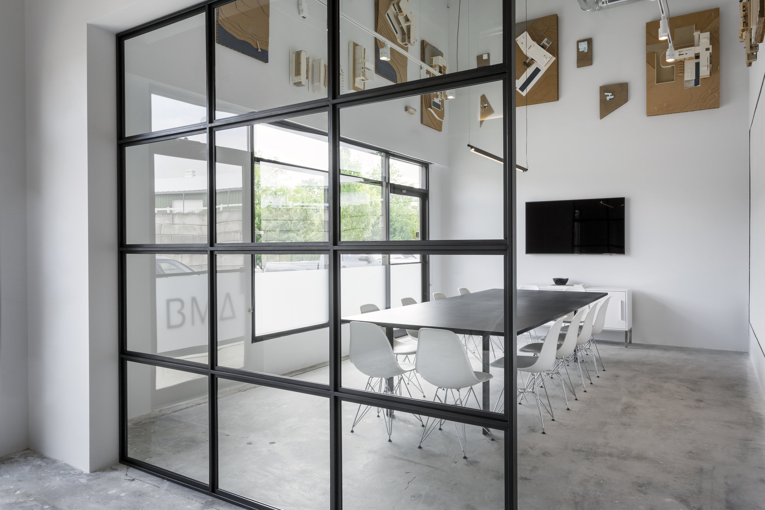
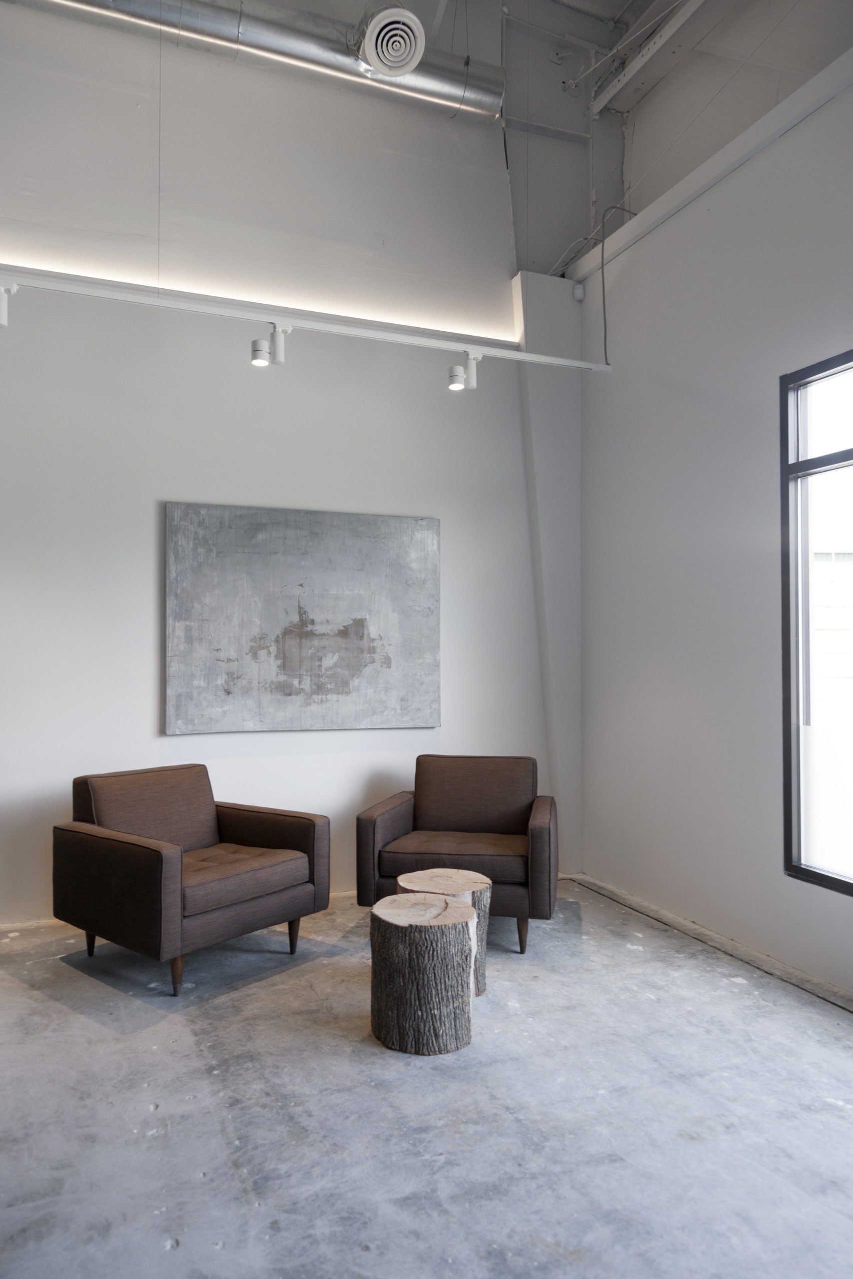
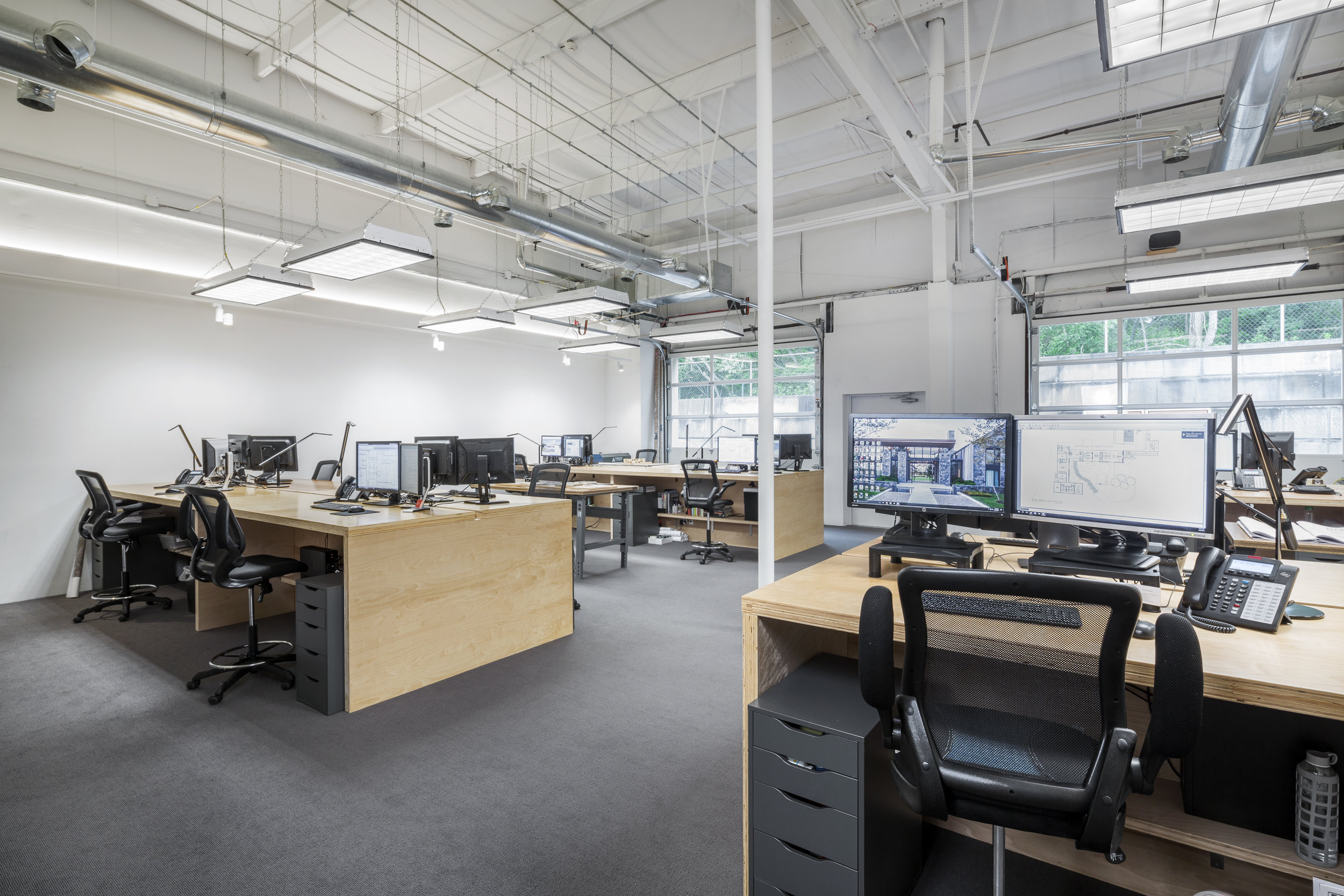
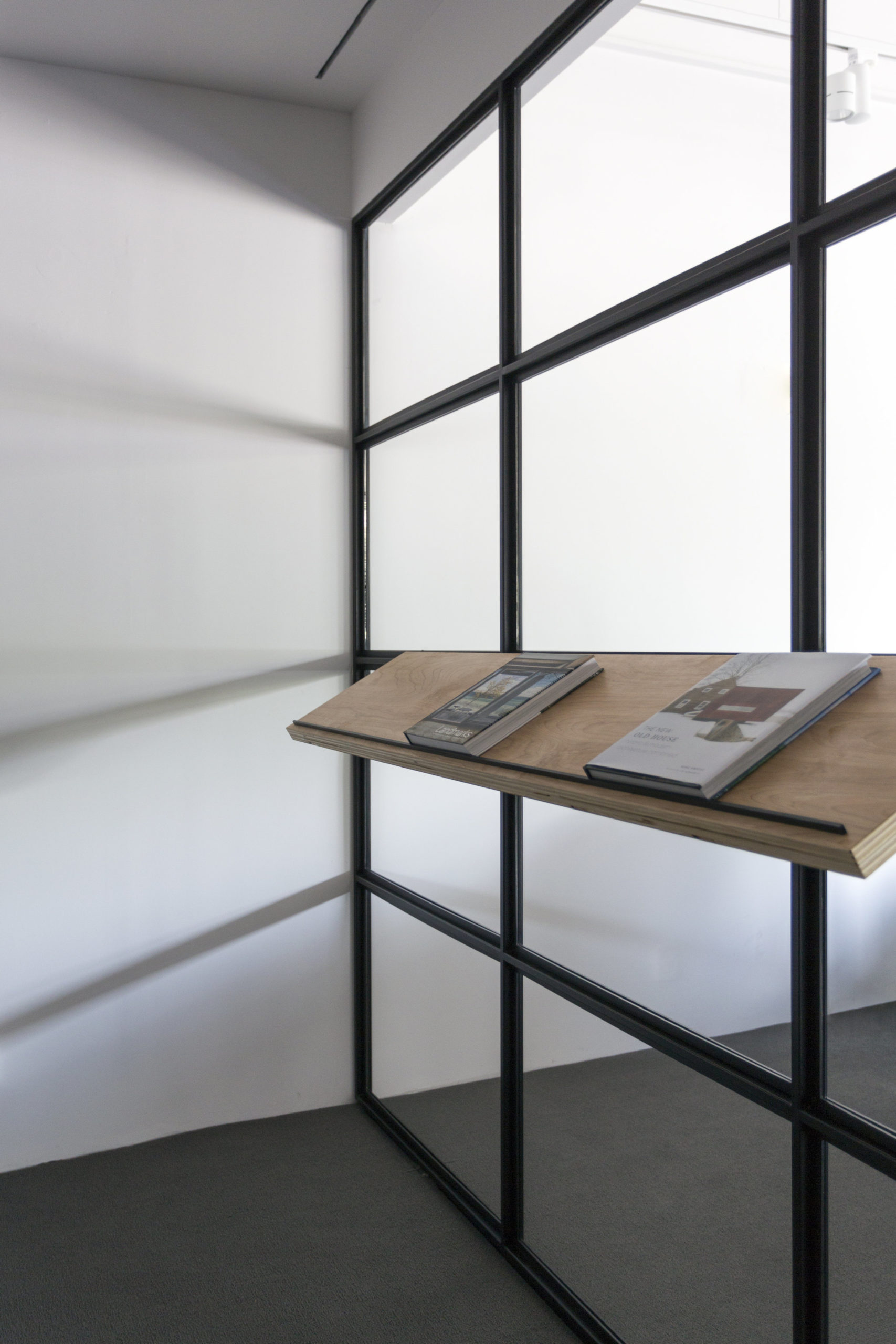
While entry, exit and bathroom cores were fixed in their location, everything else was removed, including the center demising wall, all dropped ceilings, air handlers and lighting. Aesthetically, the desire was to ‘feel’ the volume of the industrial space, so with the exception of the conference room, all partitions are held to about 10’, allowing for the steel framed, 18’ ceilings to pass over. Reception, double height conference room and Principal’s office are all centrally located at the entry hub. Conference and office walls are glass and steel built by a local fabricator. Floors are the original concrete to allow as visitors range from potential clients, to contractors straight from a muddy job site.
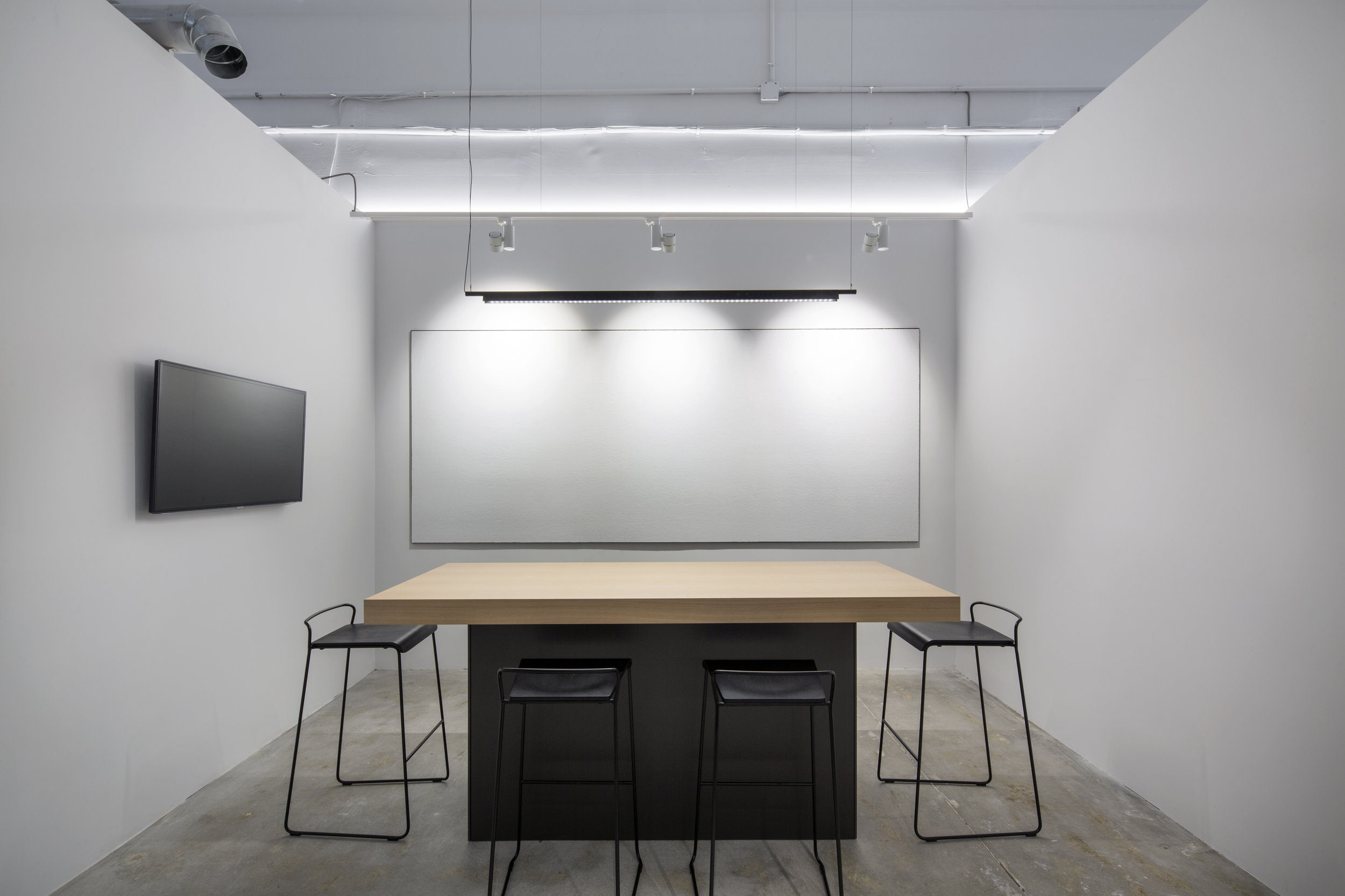
The firm works almost entirely in 3D from computer models and hand built models to construction drawings. Not wanting to part ways with these archives, the decision was made to hang all of the firm’s models on the upper half of the conference room walls as a reminder of work from the past that is typically an icebreaker at initial client meetings. For the first time in fifteen years, the office has a kitchen and café style seating allowing the staff to eat somewhere besides their desk and creating a second (of four) pin up spaces for smaller, more casual reviews.
A vote was held with the staff, resulting in a decision to design and build standing desks. This also facilitates spontaneous design discussions as staff (and principal) can stop by desks for a few minutes and easily see the screen w/o having to crouch. Four groups of four desks share an additional two pin up spaces. These tend to have project specific material that may be in discussion for longer periods of time within the project team as well as two material layout tables. While Makoid has a true office for the first time (an eventual acknowledgement to the growth of the firm, it does have a door at each end, allowing for easy access from both sides of the office. A last final detail: two small red diodes are located high in a wall in the desk area. Inspired by an airline flight, the lights indicate when the bathrooms are in use, saving many wasted trips.
Photography by: Eric Prine + attic fire (unless otherwise noted)


